Color Psychology in Home Office Design: Boosting Mood
You’re not just picking paint—you’re power-upping your brain! Try soft blue to sharpen focus or green to ease stress and boost creativity. Yellow adds a sunshine spark for low-light days, while too much red can send your calm into panic mode. Ditch the dull neutrals—they’ll drain your drive. Balance colors like a pro, and watch your mood (and productivity) soar. Ready to unleash the full spectrum of smart, happy workspaces?
The Calming Power of Blue in Focus Spaces

You don’t need a lab coat or a degree in neuroscience to know that stepping into a calm, blue-hued space feels like a mental reset button—like your brain finally exhales.
Blue helps you focus, think clearly, and stay on task without the mental static.
Studies show cooler blues reduce distractions and keep your heart rate chill, so you can power through deep work with less stress.
Lighter shades keep things peaceful without feeling like a hospital room—unless you go full iceberg blue, then good luck feeling cozy.
Use soft blue on walls or as accents with warm neutrals to avoid the “dentist’s office” vibe.
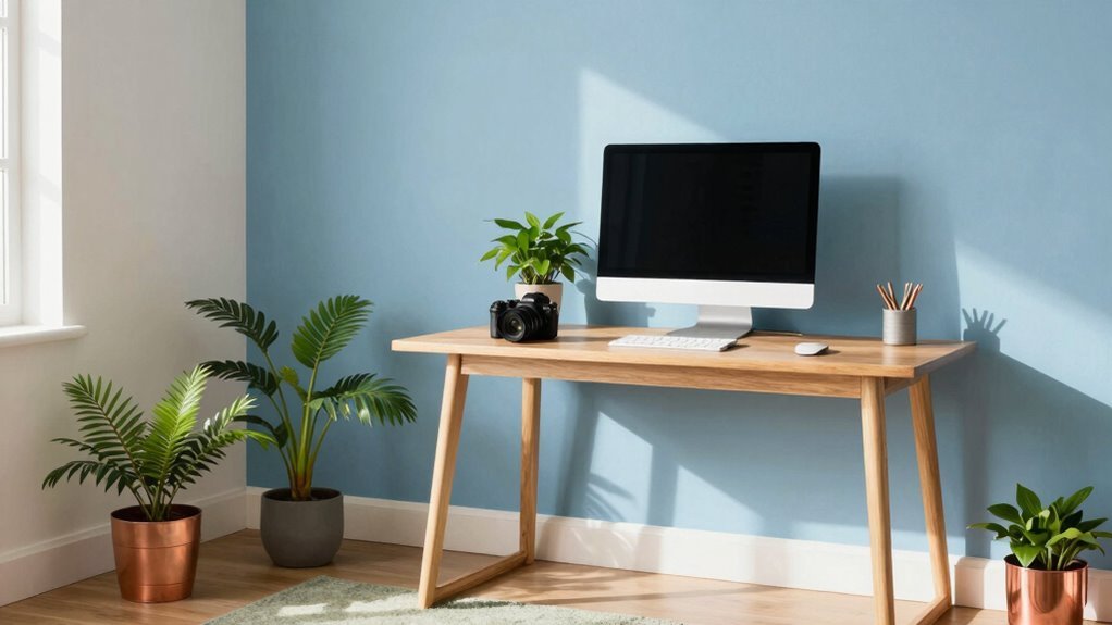
Try it behind your desk or in a study nook to create a zone that screams, “No chaos allowed.”
Pair it with good lighting and wood tones, and boom—your brain’s new favorite workspace.
Just don’t paint everything blue unless you’re secretly a penguin.
Blue environments boost productivity by up to 23%.
How Green Enhances Well-Being and Efficiency
- Green lowers stress and keeps your mood lifted, thanks to its soothing, outdoorsy vibe.
- It fights mental fatigue, helping you stay focused longer—no coffee crash needed.
- Adding greenery or sage accents boosts memory and productivity by up to 15%.
- Your eyes love it too—green’s easy on the screen-glazed gaze during long work sprints.
Pair it with wood tones or natural light, and boom—your home office feels like a peaceful power zone. Who knew nature’s favorite color worked so hard for you? Green is also said to spark creativity, making it ideal for teams valuing innovation (sparks creativity).
Using Yellow to Spark Creativity and Energy

Wake up your workspace with a splash of sunshine—yellow doesn’t just knock on creativity’s door, it bursts right in.
You’ll feel your brain light up, buzzing with fresh ideas and optimism, thanks to yellow’s power to spark mental energy and joy.
It’s perfect if you’re a writer, designer, or just need a daily mood lift—your inner innovator will thank you.
But don’t go full banana wallpaper; bright yellow everywhere can make you edgy, not inspired.
Instead, go for soft buttery tones on walls or add cheerful accents—think a sunny mug, a bright notebook, or a vase with golden blooms.
Pair it with gray or white for balance, and suddenly your space feels smart and snappy.
Yellow whispers, “You’ve got this!” while keeping things warm and fun.
Use it right, and even Monday feels a little less *meh*.
Yellow is especially effective in environments with limited natural light, helping to combat sun-deprived spaces.
Why Red May Hinder Analytical Thinking
Yellow might be your go-to for a mental boost, but red? Not so much when you’re tackling tough thinking tasks.
Sure, it grabs your attention like a pop quiz, but it might also make you freeze up when you need to focus deeply.
Here’s why red could be working against your brainpower:
- Red fires up your emotions, putting your mind in “uh-oh” mode instead of “aha!” mode.
- It narrows your focus so much you might miss the big picture—great for spotting typos, not for solving complex problems.
- Studies show people score lower on reasoning tests when red’s around, like their brain hit a speed bump.
- Red often signals danger or failure (think red “X” marks), triggering stress that messes with clear thinking.
The Risks of Neutral Tones in Home Offices

While you might think painting your home office in soothing neutrals is a surefire way to keep things calm and professional, leaning too hard on grays, beiges, and whites could quietly drain your energy instead.
You’re not imagining it—bland walls can lead to mental fatigue, making focus feel like a chore.
Too much gray feels cold and lifeless, like your office doubled as a basement dungeon.
Stark whites? They’re clean but can feel sterile, zapping motivation by noon.
Without pops of color or texture, even cozy beige turns boring, failing to fight off daily stress.
Sure, neutrals cut down distractions at first, but soon your brain hits a plateau—great for sorting emails, not for creative sparks.
Over time, the space might even feel smaller, heavier, or oddly confined, like your walls are whispering, “Nap time.”
Neutrals aren’t evil, but alone, they’re a mood dampener in disguise—kind of like wallpaper limbo.
Choosing the Right Saturation for Mental Vigor
You’ve probably played it safe with soft grays or plain whites, hoping for a calm vibe, but if your space feels more sleepy than spark, the problem isn’t your work ethic—it’s your walls.
Wake things up with smarter color saturation! Too low and you’re dull, too high and you’re jittery—aim for that sweet spot.
Here’s how to get it right:
- Go bold, not wild: High saturation in red or green boosts mental vigor and focus—just avoid neon overload.
- Warm it up: Reds and yellows fire up brainwaves linked to alertness, especially if you’re feeling sluggish.
- Balance is key: Pick medium saturation for steady energy—think earthy oranges or mellow yellows.
- Test the vibe: Your mood should feel lifted, not stressed—tweak until it feels like a mental high-five.
Color isn’t just decor—it’s your secret productivity weapon.
Matching Colors to Job Type and Tasks

When your workday calls for big decisions, creative sparks, or deep focus, the colors around you aren’t just background—they’re teammates.
If you’re leading meetings, go for blue—it builds trust, and pair it with wood tones so you feel powerful but not intimidating.
Need creativity? Paint a wall purple or add coral accents; they boost imagination like a mental espresso shot.
Designers, throw in some teal to keep wild ideas grounded.
Crunching numbers? Stick with medium blue or soft gray-green—they fight screen strain and keep your brain sharp.
For brainstorming, bring on the yellow and orange; they’re like confetti for your thoughts, sparking joy and chat.
And if you’re just trying to power through tasks, green’s your chill friend—calm, steady, and easy on the eyes.
Pick the right hue, and boom: your room’s not just pretty, it’s working overtime.
Designing Balanced Color Schemes for Mood Enhancement
Think of your home office as a mood playlist—but instead of songs, you’re using colors to set the vibe. You’ve got this! To create a space that feels just right, start with these four pro moves:
- Zone it: Calm blues and greens in focus areas, warm yellows or corals in creative nooks, and save bold reds for tiny pop-out details—like a fun sticky-note holder.
- Balance the 60-30-10 rule: Neutrals dominate (60%), a secondary color supports (30%), and a zippy accent (10%) keeps things fun without the visual headache.
- Tone it down: Muted walls let your eyes relax, while a bright chair or pillow delivers energy where it counts—like caffeine, but for your retinas.
- Add texture: Wood, plants, or a cozy rug soften sharp contrasts and keep your mood from flipping out. Who knew paint could have mood swings?
Frequently Asked Questions
Can Color Choices Affect Sleep Quality When Working From Home?
Yes, your color choices can totally mess with your sleep when you work from home—especially if your space screams “alert!” at bedtime.
Cool blues and greens calm your body down, helping you drift off easier, while bright reds or yellows? Not so much.
Swap vibrant accents after hours, dim the lights, and lean into soft, cozy tones.
Your brain will thank you when it’s time to log off and nod off—no counting sheep required.
Should Home Office Colors Differ Based on Natural Light Exposure?
Absolutely, your home office colors should shift like a chameleon based on natural light.
If sunlight floods in, cool blues and greens keep things calm and focused.
In dimmer spaces, warm neutrals and soft creams brighten the mood.
Use pops of yellow or coral for energy, but don’t go overboard—nobody wants their office to feel like a circus.
Light bounces best when you play smart!
Do Wall Colors Influence Virtual Meeting Perceptions on Camera?
Yes, your wall colors totally influence how you come across on camera.
Bright reds? They’ll make you look like a floating head—no thanks.
Stick to soft grays or deep blues; they keep things sharp and calm.
Navy says, “I mean business,” while warm whites make you look awake, even if you’re running on coffee.
Avoid neon—it’s fun at parties, not board meetings.
Test it out, trust me!
How Often Should I Change My Office Color Scheme?
You don’t need to change your office color scheme often—think of it like a favorite playlist, not fast food.
Stick with it unless it starts to feel stale or your mood dips.
If you’re bored, swap accent colors yearly or with the seasons.
Paint?
Maybe every few years.
Small updates, like cushions or art, keep things fresh without chaos.
Who knew your walls could be this much fun?
Can Paint Sheen Impact the Psychological Effect of a Color?
Yes, paint sheen totally changes how a color makes you feel—like how 50% of a color’s emotional impact sticks around longer with low-sheen finishes.
Go glossy, and you’ll feel more alert, especially with bright whites.
But pick matte, and it’ll calm your mind, softening harsh contrasts.
Satin? It’s the sweet spot—warm colors pop without going overboard.
Think of sheen as your mood’s sidekick—it’s not just color doing the heavy lifting!
Conclusion
You’ve got the palette, now paint your productivity like Monet painted water lilies—thoughtfully, with color that sings. Blue keeps you cool as a cucumber, green grows good vibes, yellow buzzes like sunshine on toast. Skip red’s drama, don’t drown in beige, and remember: colors are roommates for your brain. Pick ones that play nice, work hard, and make you grin. Your home office? It’s not just a space—it’s a mood-boosting magic carpet.